The "Big Six" Health Club Mistakes
When it comes to great architecture and design at fitness facilities, it can be easy to look back and say, "Wow, why did [or didn't] we put that in our facility?" We defer to former Supreme Court Justice Potter Stewart's standard for obscenity — we know it when we see it.
 When it comes to the interior of any facility, it is important to take into consideration the type of people that will be using it. Is it for a high school, collegiate or professional athletic team? Is it the locker room facility for the local country club? The YMCA up the street? It may not seem like a big deal, but the small details that you and your members have to live with every day are important.
You're probably wondering what could possibly constitute a health club "mistake," but the guys at Athletic Business have been around the block a time or two and have shared a few tips of what they learned from their facilities and other things seen way too often when they've visited other clubs.
1. Space
The thing we see most often? Clubs that treat open space like it is the enemy. Please, we're begging you, throw something out, especially when you bring in new equipment. This will help you address the now-common need for open floor space for functional training, and doing so will make your facility more pleasant to look at. We know that eliminating old equipment will bother some of your existing members — it always does — but please embrace free space.
2. Lockers
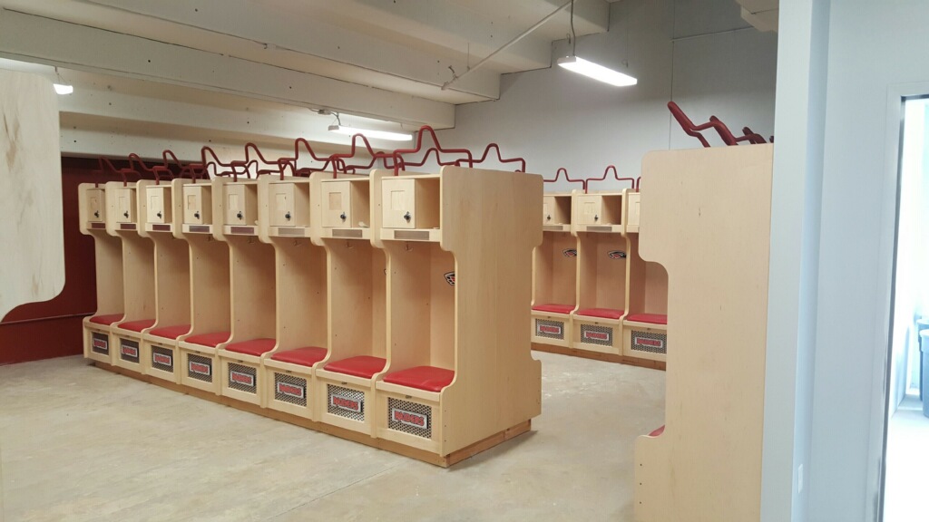
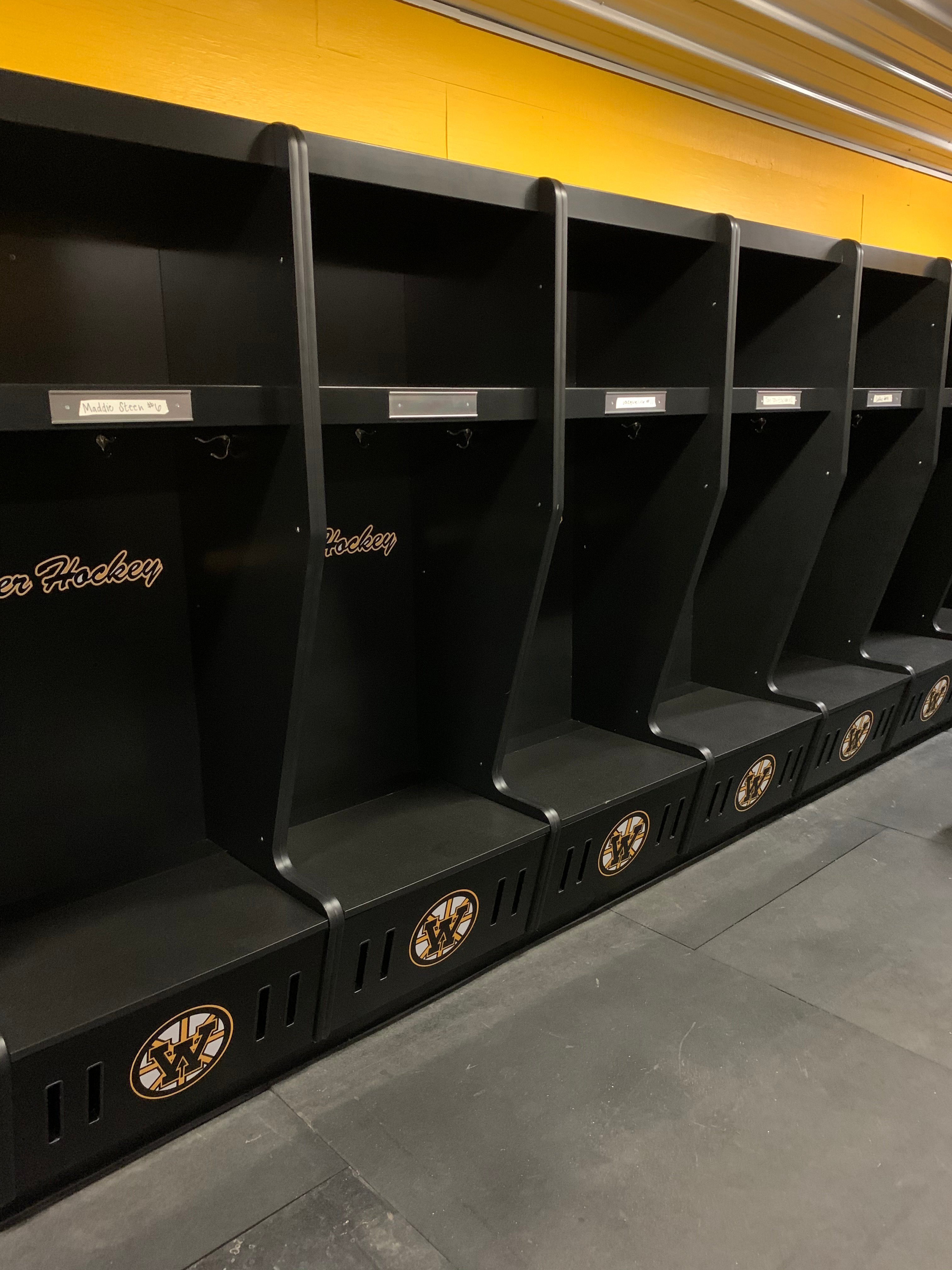
We get it- a lot of athletic team locker rooms are full of metal lockers. However, if you are responsible for outfitting a health club, its members shouldn't find the metal lockers found in the
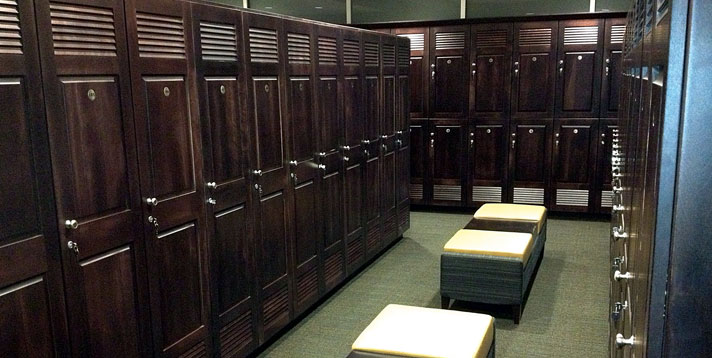
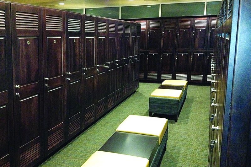
club locker room. Your choice of lockers speaks volumes about your facility, so please invest appropriately — and not as an afterthought
Lockers are among the items in which investing a bit beyond your initial comfort level makes sense, we think, because they are long-lived. Lockers, front desks and group fitness rooms are things that aren't going anywhere soon, so they are worth the extra money. If you do them well, they will stand the test of time. Wood lockers, for example, offer strength, quality and longevity and "investing" doesn't necessarily mean "to break the bank."
3. Flooring
Want to talk about carpet? Have you ever noticed how industrial carpet typically has lots of patterns and colors? There's a reason for that, which we learned the hard-to-look-at-every-day way. Although busy-looking carpet may not be ideal to some members, it sure appears cleaner. Not interested in carpet? Try tile or another hardwood type of flooring.
4. Ceilings
Who knew that ceiling tiles could be cause for such angst! Our main lobby has an inviting look and feel, largely due to oversize ceiling tiles that create a soft, warm atmosphere. Great, right? Not really — not when we need to remove one of them, like we needed to do this winter to get warm air into our rafters. We actually had to bring in a local craftsman at about $100 a visit to remove and replace the tiles, because breaking one costs $300. Now, we doubt many other clubs would even consider such ceiling tiles, but this is an example of the kind of thing you might find yourself unwittingly getting yourself into if you don't push back on your designer or architect. We did a lot of pushing back, but not on these tiles.
5.Wet Areas
 Your wet areas should also be thought of as long-term investments. Reasonably priced faucets, shower heads and toilets will probably be just fine and will be broken after about the same amount of use as ones costing much more. Don't go too cheap, but know that your members are going to do crazy stuff to break all of these things for you. Why spend too much money today on something that will cost you more money again tomorrow? Over the years, we have replaced every fancy fixture with something less expensive. We even now have $25 Rubbermaid towel dispensers where stainless-steel dispensers once hung.
On the other hand, get your counter tops right and invest a little extra in them. We have been well-served by top-of-the-line sinks and counter tops that can stand up to cleaning. In fact, in our one facility where we had a sub-par counter top, we just replaced it with a little bit better structure than our members might have even expected. It looks great, and will last.
6. Lighting
That brings us to lighting, which we believe most fitness facilities (including ours, until our renovation several years ago) get wrong. Lighting is a design issue and so much more. It impacts safety, aesthetics and how your members feel about themselves. It impacts your electricity costs, as well as your day-to-day expenses, as bulbs and ballasts need to be replaced. You need to get your lighting correct.
Our best lighting is actually where we have the least — our pool building. With lots of natural light and indirect electric light, our pool building has a calm and welcoming feeling. Our worst lighting could be found in our weight room, where we allowed it to be too dark for far too long. We were addressing that literally as of this writing, spending several thousand dollars to replace every fixture in our weight room with new LED bulbs that give off more and whiter light, while lasting longer (eight years each) and using less electricity. We expect this project to pay for itself in two years, while improving our members' experience.
Now that's the kind of design decision we can explain and get behind. We know it when we see it.
This blog was curated from an article written by Bob Bishop and originally appeared in the June 2015 issue of Athletic Business with the title "Flooring to Ceiling Tiles."




.webp)
